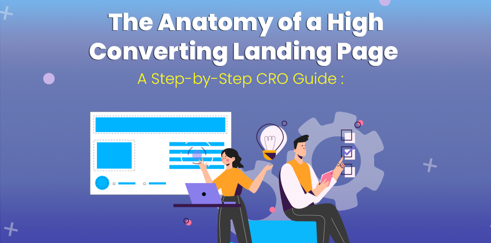
The Anatomy of a High-Converting Landing Page: A Step-by-Step CRO Guide
2nd Jan 2026
5 Minutes Read
By Riddhi Ranpura
You are spending money on ads. You are writing endless social media posts. The traffic is flowing. But there is a problem: They aren't buying.
The culprit is rarely your product; it’s usually your landing page.
In the world of Conversion Rate Optimization (CRO), we have a saying: “Confusion is the conversion killer.” If a visitor has to think too hard about what you do or how to get it, they will leave.
Today, we are going to dissect the anatomy of a perfect landing page. We aren't just looking at design trends; we are looking at the psychology that turns strangers into customers.
Here is your blueprint for building a landing page that actually converts.

1. The "Blink Test" (Above the Fold)
The "Fold" is the bottom of the screen before a user scrolls. You have roughly 3 to 5 seconds to convince a user to stay. This is called the "Blink Test." If they blink and don't understand what you offer, you’ve lost them.
The Headline
Treat your headline like a Highway Billboard. Your visitors are zooming past at 60mph. If they can't understand your offer in a split second without slowing down, they will keep driving right past your site.
- Bad: "Empowering your digital transformation journey." (This is buzzword soup. It sounds impressive but says nothing about what the product actually is.)
- Good: "Achieve More in Less Time: The Ultimate Task Management Tool."
The Hero Image
Your image isn't decoration; it’s evidence. Avoid generic stock photos. Use a "Context of Use" image that shows your product in action or the positive outcome it provides.
CRO Pro Tip: If your image features a person, have them look towards your Call-to-Action (CTA) button. Eye-tracking studies show that users will follow the subject’s gaze, leading their eyes right to your button.
Visual Example: The Hero Section Notice the clear headline, the contrasting orange button, and the product shown clearly on the laptop screen.

2. The Ratio of Attention (Remove the Navigation)
This is the easiest win in CRO. On your homepage, you want a menu bar (About, Blog, Contact) so users can explore.
On a landing page, you want to destroy exploration.
Your landing page should have an "Attention Ratio" of 1:1. This means there is one goal (the conversion) and one place to click (the button). Remove the top navigation menu. Do not give them an escape route. The only way out should be converting or closing the tab.
3. The "Trust Bar" (Social Proof)
Immediately after your Hero section, you need to answer the visitor's subconscious question: "Is this a scam?"
We are social creatures. We look to others to determine what is safe. Use a "Trust Bar" , a gray-scale row of logos to settle their anxiety. This provides immediate social proof.
- B2B: Show the logos of companies that use your tool.
- B2C: Show media outlets that have featured you, or badges like "4.9 Stars on Trustpilot."
Here is an example of a trust bar placed directly below the hero section:

4. Benefits Over Features
Features are what your product does. Benefits are what your customer gets. Nobody wants a drill (feature) they want a hole in the wall (benefit).
Structure this section using a clean, 3-column layout with clear icons to make it easy to scan.
- Don't say: "Task automation feature." (Feature)
- Do say: "Save 10+ Hours Per Week." (Benefit)
Here is an example of how to present benefits clearly:

5.The Frictionless Form
Every field you add to a signup form decreases your conversion rate. This is the law of "Friction."
Do you really need their phone number? Do you really need their "Company Size"? If the answer is no, delete the field.
If you absolutely need a lot of information, use a Multi-Step Form. Ask for the easy stuff first (Name/Email) on step one. Once they’ve committed to the small ask, they are psychologically more likely to complete the big ask on step two.
6. The Final Push (Call to Action)
Your button is the most important pixel on the page.
The Color
There is no "magic color" that converts best, but there is a rule: Contrast. If your site is blue, your button should be orange or yellow. It needs to look like it doesn't belong, so it stands out.
The Safety Net (Risk Reversal)
Near the bottom of the page, you need to catch the skeptics. These are the people who want to buy but are afraid of making a mistake. Add a "Safety Net" under your final button:
- "30-Day Money-Back Guarantee."
- "No Credit Card Required."
- "Cancel Anytime."
Visual Example: The Final CTA A high-contrast final invitation with "risk reversal" text underneath.

Conclusion: Always Be Testing
A landing page is never "finished." What works today might not work next month. The best marketers are scientific. They use A/B testing to pit Headline A against Headline B to see which one brings in more sales.
Start with this blueprint, launch your page, and let the data tell you what to do next.
FAQ Section
1. What is a high-converting landing page?
A high-converting landing page is a focused web page designed to turn visitors into customers or leads. It removes distractions, highlights key benefits, and guides users toward a single goal.
2. Why is the “Above the Fold” section critical?
The Above the Fold section is the first thing visitors see. A clear headline, hero image, and prominent CTA immediately communicate your offer and pass the “Blink Test,” increasing conversions.
3. How does social proof improve landing page conversions?
Social proof like testimonials, reviews, logos, or media mentions builds trust and credibility. Including it near the top reduces visitor skepticism and encourages them to take action.
4. Should landing pages focus on benefits or features?
Benefits drive conversions. Show users how your product solves their problems or improves their life, rather than just listing features.
5. How can I optimize my landing page for SEO?
Use relevant keywords, fast loading speed, mobile-friendly design, and high-quality content. Optimized FAQs, headings, and meta descriptions also boost search visibility.